Tuesday, September 2, 2014

2nd Semester Topical


2015 WINTER
2nd Semester
Weeks One & Two
Distorted
1o2 (relief rapid contours) + (reclining figure w foreshortening + relief tone)
2o2 (anything goes + colour) Distortions
Thumbnail Self Portraits

Weeks Three & Four
Lift-Off Drawings
Rough Self-Portraits

Weeks Five & Six
Grey Drawings
Working Drawing Self Portraits

Week Seven
Catch Up Week (Ask for the same Model as Weeks Five & Six)
Working Drawing Self Portraits + Skulls

READING WEEK

Weeks Eight, Nine, Ten & Eleven
Ivy Drawings (drawing/composition/colour)
FINAL Self-Portraits DUE

Weeks Twelve & Thirteen
Portrait with 2 Hands

Week Fourteen
Catch Up + Final Grades


In-Class Activities
10%

Thumbnail Self-Portraits
Rough Self-Portraits
Working Drawing Self Portraits
Working Drawing Self Portraits w Skull

Distorted/Lift Off/Grey Critiques


MEASURED DRAWINGS - Straight Line Drawings (brought back to curved)

using basic shape exercise (measured drawing) exercise
lightly block in figure on chair so it is centered and large enough on the page but not coming off 


continue reducing all curved lines to straight lines

once you have enough information on the drawing 
you can begin to clean up the line quality (line sensitivity + line variety) 
adding the top light source (CSLS@Top) and atmospherics (faded b/g, etc)


as seen in this drawing done by Alannah (below)


Marking Codes
Basic Shape - Straight Line Brought Back to Curved Line Drawing


Per … Perspective – have you used what you have learned in Imaging Systems class (chair legs,

            hands and feet)

APer … Atmospheric Perspective – are f/g details sharpest (with highest contrast)? And is the
foreground (f/g) differentiated from the middleground (m/g) and background (b/g) in your drawing, (ie, legs of chair, hands/feet)

[As objects recede in space their size diminishes and so does the contrast and the degree and distinctness of details. Value and colour are less intense and textures are less defined.]

Pl … Placement – is the figure centered on the page

P … Proportion – is figure drawn in proportion (see Measured Drawing techniques à Basic Shape
            and Straight Line Drawing exercises)

CSLS … did you use a consistent single side light source throughout the f/g, m/g and b/g
            (with no heavy outlines around figure or objects)

M …   Materials  - black conte on 18 x 24” newsprint (use black to ensure highest degree of contrast)

F of R … Frame of Reference – vertical or horizontal (use the one that best echoes your composition)

S … Size –  is figure drawn too large on the page (coming off) and/or too small (with more than 2" margins)

LS+LV=LQ … Line Sensitivity + Line Variety = Line Quality     

Vary the weight of your lines so that you are pressing harder in those areas where you see darker values and colours along contour edges – using a variation of lines sensitively for enhanced quality (use different types of line to reflect the tactile nature of edges and/or contours ... skin versus metal, etc) 

Treat the f/g, m/g and b/g differently ... using atmospherics and linear perspective.   

NO TONE – these are linear drawings!


NOTE:  You have a week to submit your drawings.  

If you want to return to the studio and draw from objects you can (ie, to redraw the chair so you get the perspective and lighting right, etc). Contact Security at the Front Desk (Call 4024) and let them know you would like in A107 so they can unlock the studio for you.

Michael Hampton - Video + Figure Drawing, Design and Invention Book

Figure Drawing, Design and Invention is a text used by Animation Drawing Faculty that you might find useful to take a look at. Something Michael admits is that he doesn't pay too much attention to proportions. He doesn't mean he's drawing the figure out of proportion but rather that he draws what he sees and doesn't use a formula. Here is one of Michael's videos.

I mentioned this text earlier as a good resource for doing your organic ovoids using muscle structure of the hand. You can ask to see it during breaks.


Gestural Expression - Video (Chris Warner - Otis College)


See link here ... 

Gestural Expression = Rapid Contour + Gesture

The Art of Responsive Drawing 
by Nathan Goldstein


Here is the page with the definition ... way to go internet


The Art of Responsive Drawing sixth edition Nathan Goldstein 1 Gestural Expression Deduction Through Feeling pp. 1-7 A Definition Responsive drawing is the ability to choose from an observed or envisioned subject those characteristics that hold meaning for us and to be able to set them down in concise and (to us) attractive visual terms. It is the ability to join percept to concept, that is, to merge what we see in the subject with what we want to see in the drawing, and to show this integration of inquiry and intent in the completed work. To do this we must consider one of the most compelling features of any subject – its fundamental visual and emotive nature. The French painter Paul Cezanne gave sound advice when he urged artists to “get to the heart of what is before you and continue to express yourself as logically as possible.”An important aspect of “what is at the heart” of any subject is the arrangement of its parts.And seeing this arrangement is the necessary first step. To often, however, beginners start at the other end of what there is to see. Instead of establishing a subject’s overall configuration and character,they start by recording a host of small facts. Usually, they are soon bogged down among these details and, like the person who could not see the forest for the trees, they fail to see just those general conditions that would enable them to draw the subject in a more responsive and telling way. No wonder, then, that when confronted by any subject, whether a figure, landscape, or still life, most beginners ask, “How shall I start?” The complexity of a subject’s volumes, values, and textures, and the difficulty of judging the relative sizes and the positions of its parts, seems overwhelming. There appears to be no logical point of entry, no clues on how to proceed. If the subject is a figure, many students, knowing no other way, begin by drawing the head, followed by the neck, followed by the torso, and so on. Such a sequential approach inevitably results in a stilted assembly of parts having little affinity for each other as segments of the whole figure. Regardless of the subject, the process of collecting parts in sequence, which should add up to a figure, a tree, a bridge, or whatever, is bound to fail. It will fail in the same way that the construction of a house will fail if we begin with the roof or the doorknobs, or, realizing this is impossible, if we finish and furnish one room at a time. Such a structure must collapse because no supportive framework holds the independently built rooms together. Without an overall structural design in place, none of the systems common to various rooms, such as wiring or heating, can be installed without tearing apart each room. Without such an overall design none of the relationships of size or location can be fully anticipated. Every building process must begin with a general design framework, its development advanced by progressive stages until the specifics of various nonstructural details are added to complete the project. So it is with drawing. But even before the measurements and layout of a building harden into a blueprint, there is the architect’s idea: a conviction that certain forms and spaces, and their scale, location, texture, and material will convey a certain expressive order. An architectural structure, like any work of art, really begins as a state of excitation about certain form relationships. Similarly, all drawings should begin with a sense of excitation about certain energies and patterns beneath the surface of the subject’s forms. Seeing these possibilities in the raw material of a subject, the responsive artist establishes a basis for interpretation. The “answer” to the question, “How shall I start?” is provided by the general arrangement of the subject’s forms. Seeing the harmonies and contrasts of large masses, the patterns of movement suggested by their various directions in space, and their differing shapes, values, and sizes, gives the artist vital facts about the subject’s essential visual and emotive nature –what we call its gesture.

Gesture drawing is more about the rhythmic movements and energies coursing through a subject’s parts than about the parts themselves.That is why such drawings emphasize the essential arrangement and form characteristics of the parts rather than their edges, or contours. In gesture drawing, contour is secondary to urgings of motion among broadly stated forms. Such drawings tell about the actions, tensions, and pulsations that issue from the general condition of a subject’s masses and their alignments in space – they are about essence, attitude, motivating force, quintessence, vivacity, energy, dynamism, spirit rather than specifics.

Gestures versus Rapid Contour Drawings

Gestures


1-minute drawings capturing energy inside the pose
using a half stick of soft conte, driving it around on your paper capture movement ... sensitively use line variety to describe feelings of a burning muscle, a stretched torso, a hanging hand, etc.
(think firefly inside see-through glass encasement of the figure leaving a trail behind itself depicting what the figure is experiencing and parts of the body are doing - thinking in terms of verbs rather than nouns - these drawings are not trying to capture what the model looks like)


Some Quick Warm Up Student Drawings

Two Gestures
by Zev Lewis


Two Rapid Contours 
by Abby Marincak


MEASURED DRAWINGS - Basic Shape + Relief

The Relief Tonal Line describes edges using a more tactile concept to explain surfaces and forms as they move away in space. We imagine pressing on clay to form the figure as we are drawing cross-contour lines horizontally around a reclining figure. This exercise expands upon the ideas in Weeks 2 and 3 where positive and negative space was introduced. Here we are using positive and negative spaces while using a more flexible envelope to enclose the figure also using the concept of drawing ovoids to set up the quick underdrawing. We now begin to use overlapping ovoids to explain foreshortening. The exercise also starts us thinking about what is going on inside the form, the interior surfaces. As we draw contour lines across the forms, we are thinking about different tonal values as we move from point A to point B, describing the gradual changes using varying degrees of pressure on our conte pencils. If we were to be able to describe this using what it would be like if we could control the light, it would mean that light is coming over both shoulders and hitting forms closest first causing them to be the lightest areas. As the forms move away from, they become darker. A good visual for light on a sphere where it is set up in this manner can be seen here using portrait lighting.


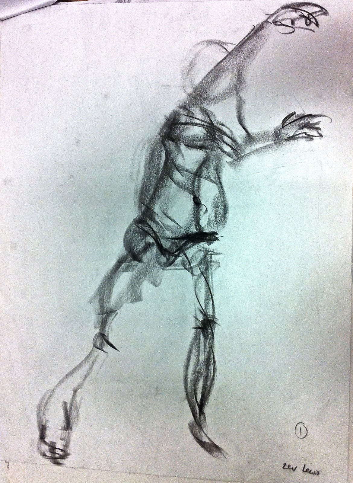
Jessica's relief drawing has a very good sense of spacial awareness (the foreground hand and foot have been enlarged - this  allows these forms to come forward).


Frank's After Drawing
Relief Cross-Contour Reclining Figure
hair has been fixed so that it now follows contours of the form
Franks Before Relief Cross-Contour Reclining Figure Drawing
Also, here, on this site about how to render a topographical map, it illustrates relief tonal rendering, a cartography rendering technique used to describe 3D surfaces.

digital elevation map
In this image, each shade of gray represents a height in the final rendered map, being white the highest height and black the lowest height. In fact, any grayscale image can be used as a Digital Elevation Map. It is just that real height maps look better than faked height maps, unless you are trying to achieve a “unreal” look.


William Berry's book, Drawing the Human Form has a large section dedicated to Relief Tonal Rendering. We can now begin to add tone to our quick drawings using this idea. (see Handouts)


AND now 
... some very fine work done by some Art Fundamentals' students 

(some drawings just needed a few tweaks we discovered during critique)
before & after drawings 


More Student Relief Cross-Contour Drawings
internal lines along torso could be more gradually integrated so they blend
good use of overlap showing foreshortening and size differences between feet & hands to show  proximity to viewer


do a quick light drawing - concentrate on outer 3 points & lock into 
points so you can complete a rapid contour once angles are discerned 
see the triangle in your minds eye and get it drawn on the page 
if it's too small you can enlarge it & lock into points on drawing
that are farthest North, Southwest and Southeast on the page

begin measuring and finding proportions (see below)


BASIC SHAPE EXERCISE

(Measurements + Proportions)

To do a realistic rendering, we want to employ careful observation and engage our intuition. In other words, we want our drawing to be accurate but not at the expense of losing the gesture. To do this, we will swing back and forth between some right and left brain techniques in this exercise.

NOTE: BEGIN with a VERY LIGHT and LOOSE DRAWING (first use your L-frames to see if the pose is horizontal or vertical and turn your paper so that the Frame of Reference echoes his). This gets something on the page to correct. Use the following (and an eraser) to make corrections to your very light drawing. Keeping your work light while you are checking landmarks on your drawing will alleviate frustration.

1.      THEN find LARGEST ‘Basic (square/circle/triangle) Shape’ that holds pose [(or almost the entire pose)  NOTE:   Small portions can be outside the envelope. In all the poses we will be doing from now until the end of the 1st Semester, you will be looking for a triangle. Ask yourself where the farthest point North on your page is and lock it into place by drawing a line from this point to the lowest point Southwest on your page and lock it in while you join it to the lowest point Southeast on your page (include the chair and cube if applicable).
·      If necessary, find other ‘Basic Shapes’ required to enclose the rest of the pose in its’ entire envelope.  See example;  [large triangle + two smaller triangles (on either side) = Pentagon Envelope ... proceed to find as many triangles within the pose as you can and check to see that your angles match what you see in the pose ] (left brain)
·      If the shape(s) need(s) to be reduced or enlarged in size, now is the time to do this.  Make sure to take great care at this stage in creating the right shape.  AND don’t change shape(s) when changing their size (or centering it/them).
NOTE:  When centering your shape(s), remember to place ‘intuitive’
center onto the central diagonal ‘cross-hairs’ of your drawing paper.  

2.     Continue your very light and loose drawing inside the envelope [go over gesture (action lines (S/C-shape(s), axis points,  etc.) and redevelop your very light quick contour (same thing as a rapid contour).  Don’t draw too loosely though.  You need to be sure your drawing fits properly within the envelope and that the points on the figure you initially used to create the LARGEST ‘Basic Shape’ are locked into place properly. (right brain)

3.     Progressively find ‘Next Largest’ Basic Shapes within LARGEST ‘Basic Shape’.
As an artist, you learn to see the subject as one holistic shape rather than as we might naturally be accustomed (seeing parts first that make the whole).Again, work your way through this part of the exercise, finding the next largest shape … then next largest (left brain) … make light adjustments to drawing (right brain)

4.     Find your first ‘unit of measurement’. NOTE:  Remember to line yourself up perpendicular to the model (and straighten your drawing board and drawing pad).    Many artists use the head as a unit of measurement.  Try this (don’t be fooled into believing there are always a set number of ‘heads’ in the figure.  Artists in the past attempted to ascertain perfect proportions and often adhered to strict guidelines; but in trying to free themselves with formulas they actually restricted themselves to nearly impossible situations and standards.   As soon as a person leans forward, their head is foreshortened.  As soon as a person stops standing in an upright position, the measurements no longer hold.  If you are drawing a person who doesn’t have ‘classically perfect proportions’, your formulas won’t work.   It is always best to learn to make measurements for each drawing you do (whether it be of people, places or things).

Begin by holding your measuring tool (pencil = plumb line) loosely in your hand at the top and let it drop down and settle until you can sight a true vertical position (using your ‘camera eye’).  When you know where true vertical is, you can hold your pencil firmly at the bottom, keeping your arm straight (remember to lock your opposite arm into your body so you can cup the elbow of the arm holding the measuring tool into the palm of your opposite hand).  Be careful to choose points on the head that you can always return to when rechecking your measurements (ie, where the hair meets the forehead, the crown of the head, etc).   How many heads fit into the pose you are drawing?   How many heads are there in your very light and loose drawing?  How many heads fit into half the length of the pose?  (what about a quarter of it)?  You can check to see if your drawing stands up to these tests now!  (left brain)

5.     Make adjustments to your light and loose drawing (use your eraser and continue to draw very lightly and loosely (but not too loosely).  (right brain)

6.     When we measure, we find a proportion.’  In other words, when we are measuring we are finding the relationship between height and width.

HOW TO measure the height and corresponding width of the pose (ie, ‘Basic Shape.’)

·      Hold measuring tool upright in the vertical position.  Line up the top of your tool with the top of your subject and adjust your fingers so they mark the bottom of the subject.  This unit of measurement corresponds to the height of your subject from your (stationary) point of view (POV).
·      Without shifting your fingers, turn your tool horizontal (line horizontally up with the edge of your drawing board).  With your free hand mark off the width of your subject (at its’ widest points).  [The relationship between the two measurements is the ratio of proportions to one another.]  We can get very left brain at this point and take out a ruler to see what the numerical values are so we can check on our drawing pad to see if we need to make adjustments.

[and again - back to the enjoyment of doing light and loose ‘fix up’ drawing] right brain

7.     Check strong diagonals in the pose.  Using your body as a ‘tool’, stand up straight; and one by one, line up the diagonals using your measuring tool.  For each, drop your arm straight down onto the paper without twisting your body. They should correlate directly with angles you have ‘sighted’.  Sometimes, it’s useful to pretend your measuring tool is able to be inserted into the figure (as if it is part of an armature on a sculpture and/or an actual bone in its’ skeleton) to see if angles on a leg or an arm have been properly seen and drawn. (left brain)

[and again - back to the enjoyment of doing light and loose ‘fix up’ drawing] right brain

8.     Drop vertical (and horizontal) lines down (and across) your subject to check and see if things are lined up properly beneath specific points.

[and again - back to the enjoyment of doing light and loose ‘fix up’ drawing] right brain


I did a quick, light loose drawing  ...
a few more lines & clean up can begin 
using close observation, a measuring stick 
and an eraser (to clean up lines that are no longer useful)


Two Measured (Basic  Shape) Drawings are DUE in WEEK 10
The largest   is light & ethereal. It looks like an elastic might be holding
the 3 farthest points of the figure together - the  is locked into the figure


 STUDENT EXAMPLES from 2012


Annie Zeng 
Two Measured (Basic  Shape) Drawings

the chair is a little short but negative shapes have been carefully observed throughout most of the drawing
Notice the hair on both of Annie's drawings has been drawn finding the shape and smaller shapes with the large one and then capturing details along their edges

again the chair is a little too small which compromises the length of the legs on the figure however the Line Quality on clean up is very well-done. Improvements might be made to Line Sensitivity by softening the lines used for skin as opposed to the crisper line that could be used for the chair ... so the hair, the chair and skin are visually varied enough to suggest differences in their tactile nature

There is an attitude in both Annie's drawings (as in the two drawings of Eleanor's below) which alludes to the gesture of the pose. In other words, the drawings don't feel stiff. We feel the turn of the body and weight of the pose.


Eleanor Martin
Two Measured (Basic  Shape) Drawings


the chair is a little too short but the drawing has been carefully-observed
the hair doesn't need to be drawn in detail (find the shape and carefully detail edges using CSLS@Top)

the chair is slightly wide which distorts the size of the model's legs ... here the hair feels ok, it's soft and downy - it breaks the rule of finding the shape because using just a few lines visually well-describes what is seen 
and overall the whole drawing is very well-observed ... there is a definite feel for the gesture that remains
(you can see and feel the weight in the right hip)

internal lines along torso again could be more gradually integrated so they blend
a good understanding of the form of the hair is seen here


another set of lines between each of these lines would depict form more readily
good use of contour line around head and nice use of contour lines describing twist of torso towards viewer

this drawing has used outline to describe edges - it needs to be erased between contour lines using hooking to do this excellent placement and sizing on the page illustrating good use of the envelope to locate figure within

again drawing has used outline to describe edges and needs to be erased between contour lines & use hooking
and again excellent placement and sizing on the page illustrating good use of the envelope to locate figure within

Continuous Atmospheric Line Drawing - Week 2 of 2

This drawing is almost finished the clean up. There is still a little more work to do. Either the middleground needs to be less detailed and less contrast (a clean kneadable eraser can fix this up quickly by laying it over large areas and pulling back) or the foreground needs to have a few more details added and the contrast needs to be heightened (some areas made a little darker and some areas a little lighter so the full 9-tones are apparent in the foreground) and the background needs to be a little more faded to release it from the middleground (again use the kneadable eraser to fade objects in the b/g). NOTE: The ellipses on the chair in the b/g and the spot lights could be more carefully drawn.


Atmospherics (See Handouts) for use of 9-Tone Grey Scale <- click and refer to Fig. 5.25 -> to describe f/g, m/g, b/g


I remember being very impressed by Vanessa many years ago. She had missed the second Continuous Line Drawing class and so she asked her twin sister to pose in A107 on the podium so she could get the drawing done. They signed in at the Front Desk and asked Security to let them into the studio.

Continuous Line Drawing - Week 1 of 2


Continuous Line Drawings
 

[Next week we will add atmospherics to this exercise.]

start by dividing your page in three horizontal sections (b/g, m/g, f/g)
draw a circle in the center (this is where our focal point, the model will reside)

1. Do a quick gestural expression inside the central focal point of the model
2. locate the end of the drawing horse (close one eye - find it in relationship with the model - draw it in)
3. do the same with your drawing board (find it in relationship with the end of the drawing horse and draw it in)
4. Line up your drawing stick with a point on the model and secure it in place so it doesn't move. 

5. Begin your continuous line drawing at the drawing stick. Move through the foreground into the middleground and continue drawing paying close attention to negative shapes and their locations to one another as well as their sizes in relationship to the objects. If a background object touches the edge of an object in the middleground begin to draw in the background. Make sure you come off the page on at least 3 or 4 sides. The composition should be balanced when you are finished and not feel that one side or the top or bottom is unfinished. 

In the studio, light is coming from the top. Details and contrast diminishes in the background but we should still be able to tell that the light is coming from the top. The values will tend towards the light side of the 9-tone grey scale. 

Here are a few photographs of the very first continuous line drawings done before break in Week 4.

I was so amazed again this week at how well everyone did on this very complex assignment ... so much so that while we were on break, I began to randomly shoot photos of the work that had been left out. 

Thanks everyone for allowing me to post these shots on the blog.


SOME SKETCHBOOK FIGURE DRAWING APPLICATIONS
based on these exercises

tweeted by Richard Johnson
@newsillustrator
26 Apr 2014

Also see Drawing D.C. Together, a Journal of Urban Sketches,  blog post, called The Trouble With Sketching People, written by Richard Johnson, here


STARTING to DEVELOP YOUR SKETCHBOOK
see here
Some CalArts Sketchbooks - Dig into your Drawing Kit. Start using the coloured pastels and pencils, begin to mix media (use markers and ink with coloured pencil) ...  apply what you're learning 


use of negative space to create Balance in the composition on these pages ... use of monochromatics (Colour Harmony), with a variety of quick poses (Rhythm).


... and another CalArts Sketchbook 

Sheridan Animation Student Blogs ... here  and here 
and 
Sheridan Illustration Work ... here  and some former drawing students using coloured pencil in their professional work here and here  some coloured pencil here  and pastels on pavement here

Sheridan Faculty Illustration Blog here